How High-Contrast Graphic Design Changes Organic Social Media Reach
Every brand is fighting a losing war against the thumb. As a premier Facebook and Instagram ad expert in Delhi, we watch businesses burn massive creative energy on beautiful, muted, pastel aesthetics only to watch their reach flatline. Why? Because the modern social media feed rewards friction, not subtlety.
If your graphic design lacks stark visual boundaries, users scroll past. When users scroll past without pausing, the algorithm buries you.
Organic visibility is no longer a game of simple keyword matching or frequent posting. It is a game of neuro-attentional capture. High-contrast graphic design fundamentally alters how the human eye processes information on a digital screen, forcing an increase in organic reach through measurable behavioral metrics.
The Attentional Hijack: Why the Human Brain Craves Visual Friction
The human brain processes images 60,000 times faster than text. But there is a catch. The brain is also incredibly lazy. It constantly filters out predictable information to save metabolic energy.
When a user scrolls through a social feed filled with similar corporate blues, soft gradients, and low-contrast lifestyle photography, the brain enters a semi-hypnotic state called automaticity. The visual field blurs together.
The Physics of the “Thumb Stop”
High contrast breaks automaticity. When a graphic utilizes a pure black background paired with sharp neon typography, or contrasting complementary colors from opposite sides of the color wheel, it creates an immediate sensory shock.
For brands executing ROI-driven paid advertising in Delhi, replacing standard brand-guide pastels with an aggressive, high-contrast structural grid system yields immediate dividends. Stark contrast creates visual friction. Friction creates a micro-pause. A micro-pause translates directly to dwell time.
The Contrarian Take: Your “Prettiest” Designs Are Destroying Your Reach
Here is a truth most design agencies refuse to admit: Aesthetics do not equal engagement.
The design industry has spent the last decade obsessed with minimal, low-contrast, Scandinavian-style elegance. That looks beautiful in an art gallery. On a 6-inch mobile screen being scrolled at 50 miles per hour while someone waits for the metro? It is completely invisible.
The Reality Check: Algorithms do not have eyes. They do not care about your nuanced, subtle color transitions. They care about user behavior. If your graphic is so beautifully integrated and subtle that people fail to distinguish the text from the background instantly, your organic distribution dies.
Stop designing for creative directors. Start designing for the retina.
The Empirical Proof: What 5 Million Social Ads Reveal About Contrast
Many marketing teams treat design as a subjective choice based on pure intuition. However, large-scale data analysis proves that visual contrast directly dictates performance on modern feeds.
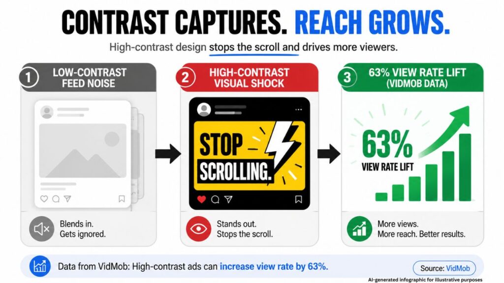
An exhaustive performance study conducted by the intelligent creative platform VidMob analyzed over 5 million video ads across Facebook and Instagram. They tracked user behavior across three core actions: three-second view-through rates, click-through rates, and final purchase conversions.
The data removed all ambiguity. When analyzing performance within the personal care and consumer verticals on Facebook and Instagram Stories, high-contrast visual assets drove a 63% lift in campaign view rates compared to lower-contrast, blended alternatives.
This is where a specialized B2B lead generation company can find massive arbitrage. When you increase your organic three-second view-through rate by over 60% purely through color design choices, you train the platform’s delivery algorithms to prioritize your content profile, lowering your baseline distribution costs permanently.
Deciphering the Machine: How Algorithms Translate Design Into Distribution
How does a purely visual choice like contrast affect an organic algorithm? The machine looks at three primary downstream metrics.
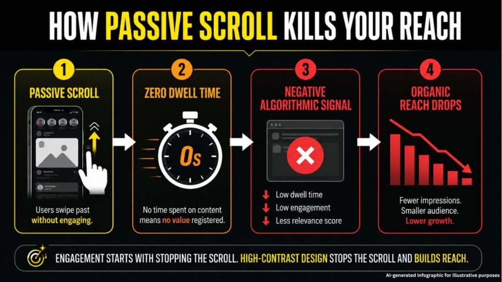
1. Dwell Time Amplification
Modern search and social algorithms monitor exactly how many milliseconds a post remains active on a user’s viewport. High contrast forces the eye to track a specific shape or headline, lengthening that initial pause. The platform registers this as a strong positive signal, assuming the content has high contextual relevance. It immediately pushes the post to a wider lookalike audience.
2. Immediate Comprehension Metrics
In the era of Generative Engine Optimization (GEO) and Answer Engine Optimization (AEO), platforms use advanced optical character recognition (OCR) and computer vision to read your images.
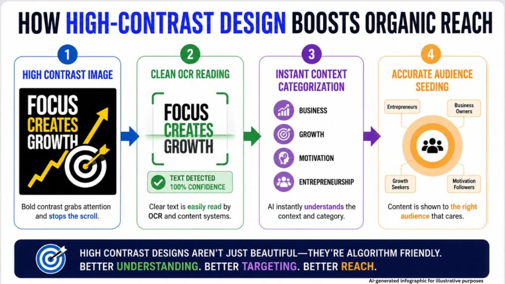
When an image lacks contrast, AI vision models struggle to cleanly parse the text and core subjects. If the machine cannot immediately classify your post’s intent, it will not risk showing it to users. High contrast ensures both human eyes and machine scrapers read your message perfectly on the first pass.
The Technical Blueprint: Designing for Maximum Cognitive Processing
To build a high-converting asset, your brand needs to move beyond generic color choices and implement structural contrast rules.
Contrast Ratio Metrics
Aim for a contrast ratio of at least 4.5:1 for standard body copy and 7:1 for primary headlines against your background elements. This complies with standard accessibility guidelines, which coincidentally line up perfectly with what social media algorithms look for.
Structural Isolation
- Chiaroscuro Framing: Place dark elements directly next to intense light elements without soft transitions.
- Scale Asymmetry: Pair massive, bold sans-serif headlines with tiny, clean secondary elements to create a dramatic depth of field.
- Negative Space Density: Leave up to 60% of the graphic entirely empty. This forces the human eye directly to the high-contrast focal point without distractions.
Implementing the Transition Without Damaging Your Brand
You do not need to abandon your existing corporate identity to benefit from high contrast. It is about applying your existing color palette with extreme structural intent.
Find your brand’s absolute darkest tone and your absolute absolute lightest tone. Force them to interact directly on your graphics. Eliminate soft mid-tones, drop shadows, and complex textures that blur visual boundaries.
The future of digital distribution belongs to brands that are easy to see, fast to read, and impossible to ignore.
Stop letting invisible design drain your marketing budget.
Let our growth strategists analyze your current social media creative and show you exactly where you’re losing organic traction.
- Let’s Talk: Call us at: +91-8375888772
- Drop Your Handle: Email us your social links at: info@shareandaware.com
- Consult in Person: Visit the Share & Aware office at:
991, Studio Apartments, Near Exit Gate 2, Sector 16B, Dwarka – 110078